Kroger Style Guide
Kroger is one of the largest retailers in the United States, serving millions of customers each day across thousands of stores and digital touchpoints.
Project Details
50+ designers
35 stakeholders,
20+ podcast episodes,
12 standups,
10+ pages,
5 weeks,
4 agency reviews,
3 systems teammates,
2 discoveries,
1 Style Guide
Context
Kroger launched a major brand transformation in partnership with DDB Worldwide, introducing a new logo, typography, color system, and brand characters (“Krojis”) as part of the “Fresh for Everyone” campaign. This transformation was designed to unify Kroger’s identity across physical and digital experiences and differentiate the brand in an increasingly competitive grocery market. Shortly after, the COVID-19 pandemic accelerated a massive shift toward online grocery, pickup, and delivery, creating new digital touchpoints at unprecedented speed. The new brand existed but there was no clear system for applying it consistently across digital products and the existing design system was engineering led and very technical without a lot of flexibility for brand value and the modality for purchasing groceries was shifting from in-store to online.

The Opportunity
The brand transformation created misalignment between brand guidelines and product experiences. Product teams struggled to translate the new identity into usable UI patterns, leading to inconsistent layout systems and spacing, fragmented component implementations, unclear usage of typography and color, inconsistent application of brand assets (Kroji characters and food photography). An audit of Kroger’s digital ecosystem confirmed that inconsistency existed across both web and mobile customer experiences, as well as the associate experiences.
The convergence of a brand transformation and a rapid shift to digital grocery created a clear opportunity to define a system that translates brand into product while scaling across experiences. The system needed to unify brand and UX, support web and mobile platforms, enable faster iteration during rapid product expansion, maintain consistency across new customer touchpoints
The convergence of a brand transformation and a rapid shift to digital grocery created a clear opportunity to define a system that translates brand into product while scaling across experiences. The system needed to unify brand and UX, support web and mobile platforms, enable faster iteration during rapid product expansion, maintain consistency across new customer touchpoints

The Goal
Create a centralized digital style guide and governance model that enables teams to consistently apply Kroger’s brand across product experiences while supporting rapid growth in pickup and delivery services.
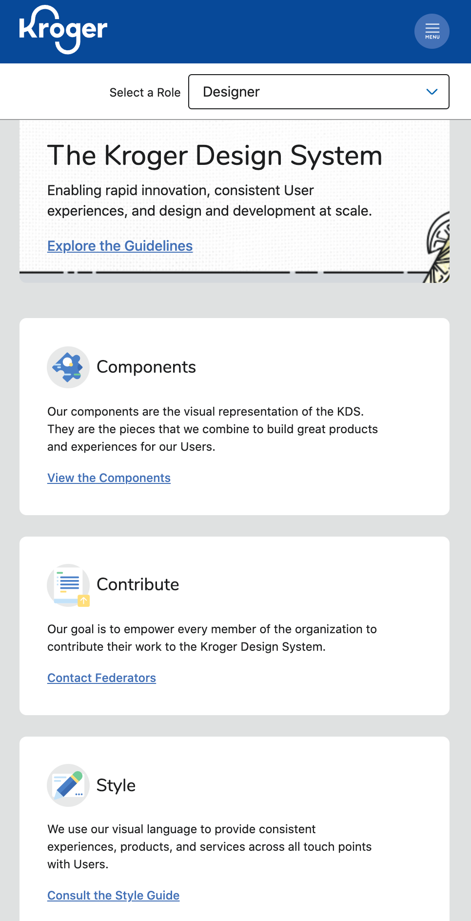
The Solution
Design and launch the Kroger Digital Style Guide, a system that translated brand identity into practical product design guidance. This transformed brand guidelines into usable design system.
The system included:
1. Color usage and accessibility rules
2. Typography standards for web and mobile
3. Grid and layout systems
4. Component libraries
5. Photography and illustration guidance
6. Motion and interaction patterns
7. A federated governance model
8. A podcast to demonstrate the guidance
9. Hundreds of design reviews, office hours, and on-call support


The Challenge
This work took place during the pandemic, when digital grocery demand surged rapidly, teams were launching new features constantly, and consistency and speed were often in tension. The challenge was to create structure without slowing teams down

System Foundations
Color System
Defined color roles and usage patterns with a focus on accessibility. WCAG AA compliance (4.5:1 contrast) and functional color usage over decorative usage.
Typography
Kroger’s brand typeface was not web-safe, Nunito font was replaced for digital use and we kept Poppins for print.
Grid and Layout
Established a mobile-first grid system with consistent spacing, a predictable structure, improved scannability.
Brand Assets
Defined clear rules for Kroji illustrations, food photography, brand personality across interfaces, and UX Writing.
Design System Enablement
Created an internal podcast to teach system usage, explain design decisions, improve cross-team understanding, and interview partners. Led ~100 design reviews and additionally led office hours, aligned teams across products and experiences. Built scalable UI libraries with clear atomic → molecular → organism components. Aligned naming with React libraries. Improved handoff and development speed.
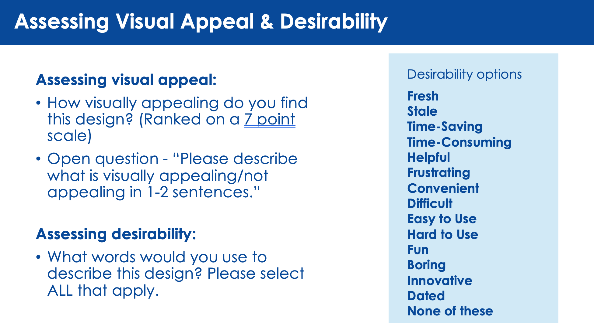
Desirability Testing
To inform the direction of Kroger’s digital style guide, desirability testing was conducted to understand how customers perceived different visual and interaction approaches along the spectrum of transactional to experiential. Concepts explored ranged from highly utilitarian, efficiency driven designs (similar to Walmart) to more lifestyle oriented, brand forward experiences (similar to Target). The common transactional vs. experential marketing decisions needed to be made. Through user feedback and preference testing, the work evaluated which direction best aligned with customer expectations, brand perception, and usability needs. The findings helped guide the system toward a balanced approach prioritizing clarity and efficiency for core shopping tasks while introducing moments of brand expression to elevate the overall experience.


The Screens
Outcomes
The Digital Style Guide became a shared foundation for Kroger’s product teams, enabling more consistent and scalable experiences across web and mobile. As Kroger expanded its digital grocery services with pickup and delivery, the system helped teams apply the new brand consistently across rapidly evolving customer experiences. Rather than slowing teams down, the system improved alignment, reduced inconsistency, and supported faster iteration. This project demonstrates how a design system can fill the gap between brand and product, while enabling teams to scale during rapid change.
